Based on The History of Electrical Engineering Newsletter, January 2011 (Japanese). Don’t take this as a completely accurate translation.
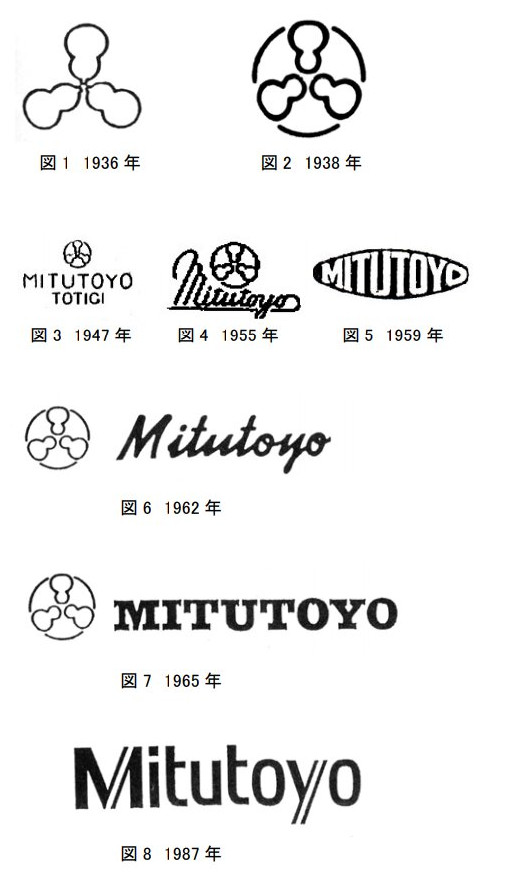
Image taken from the PDF above.
The name ‘Mitutoyo’ came from the thought that 3 virtues are required to become a decent human, 3 things are required for a company to succeed, 3 virtues for buddhism, the holy trinity - basically that the number 3 (三) was lucky, and the ‘toyo’ (豊) is something like ‘virtue’. Hence, ‘三豊’ (Mitsutoyo).
Based on the company name, the ‘toyo’ was associated with Toyotomi Hideyoshi. Toyotomi has an association with gourds so the initial logo was designed as 3 gourds. This was used from the start in 1936.
For the next revision (#2, 1938) the circle was added to to stabilize the design and symbolize harmony.
Logo #3 was used from 1947, on the first micrometers shipped after World War 2. The source article doesn’t mention why the MITUTOYO lettering was added.
In 1955 stainless steel calipers were developed, and received logo #4.
In 1959 logo #5 was used for micrometers and dial indicators made in the Utsunomiya factory. In particular, this includes dial calipers being pushed in the US.
In 1962 logo #6 was decided on as the new logo for the entire company. All products were eventually changed over to this logo.
Logo #7 was registered in 1965 and again applied to all products.
In 1987 株式会社三豊製作所 (the manufacturing company) and 三豊商事株式会社 (sales company) were merged into 株式会社ミツトヨ (Mitutoyo Corporation).
In preparation for that and in celebration of the company’s 50th anniversary, the company launched a corporate identity project. The company’s official name was changed to katakana, and logo #8 became the official logo. The gourd mark remained as the company’s flag, official seal and mark. This remains as the current logo.
In Hepburn romanization the name would have been Mitsutoyo. I suspect it ended up as Mitutoyo because the spelling was decided in 1947, before they had an international presence.
The gourd logo doesn’t seem to appear on their website, but it’s visible on their building in Kawasaki.
If you’re using this to estimate the production date on old Mitsutoyo gear, it sounds like the logo changes, particularly around #6, were rolled out gradually.